Logo Design/Branding
Design Studio | SMC 2022 _______________________________________________________________________________________________________________________
Brief
__________________________
Outcome
_____________
Tools
Design a cohesive branding for a museum exhibition, and re-design the existing logo to a new, scalable design.
Create merchandise the reflects the work of an artist of choice, a brochure explaining the exhibit and promotional poster.
________________________________________________________________________________________________
I chose the The Getty Center as my institution to re-design. My solution was an inverted monotone letter mark logo, creating a high contrast and simplistic design. My poster design acts as a series of 3 pieces from one large landscape painting, that could work individually or as a set. To showcase the artists work, I placed emphasis on their name within all the designs. _____________________________________________________________________________________________________________________________________________________________________________________________
Adobe Illustrator, Adobe Photoshop
Logo Re-design_____________
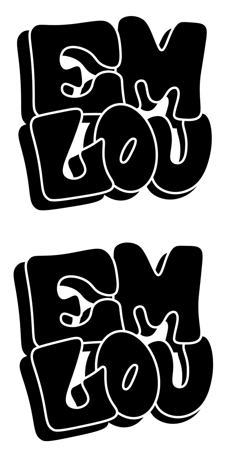
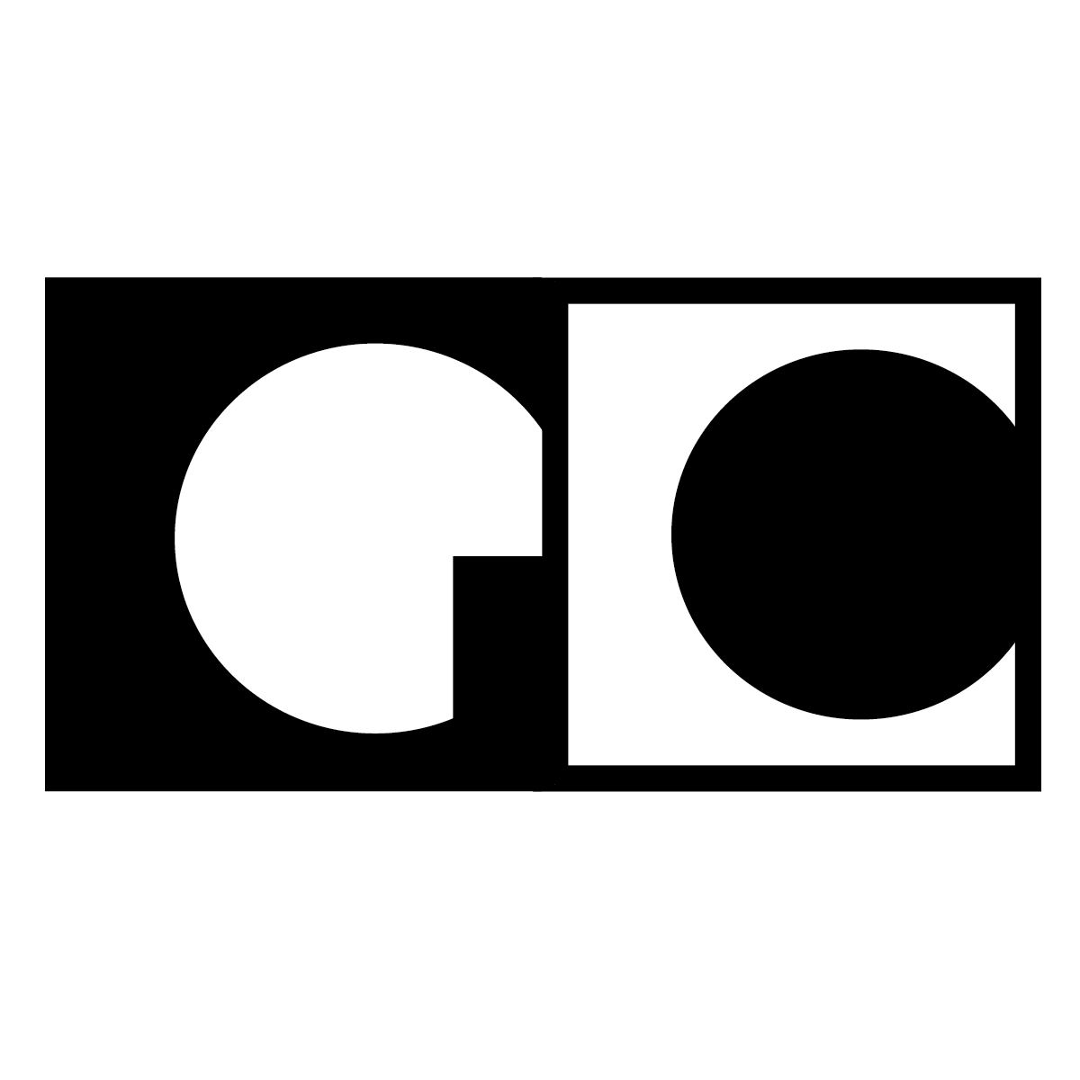
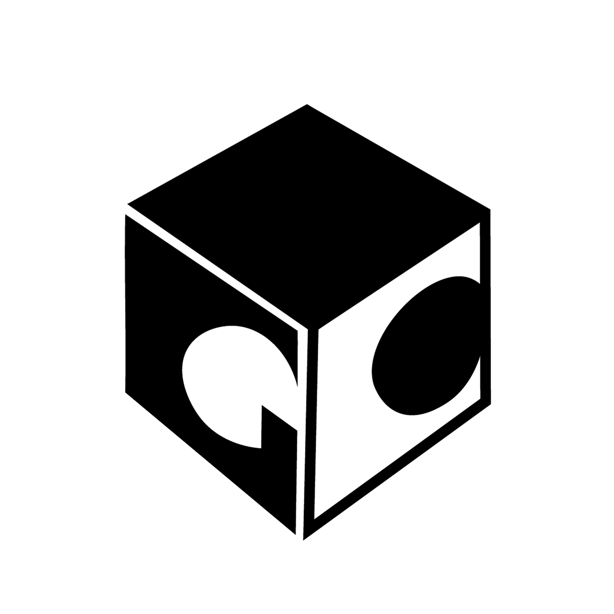
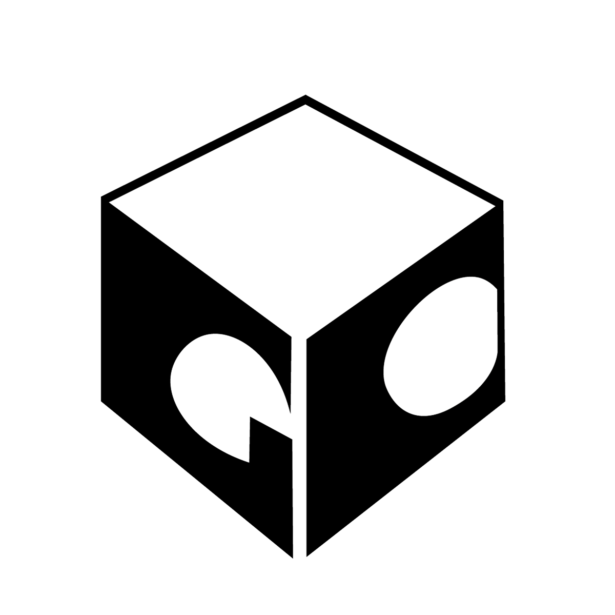
My solution for this logo redesign, was to create a letter mark with a more modern approach, compared to the traditional word-mark original logo. I utilised the positive and negative space of the letters G and C in order to create a highly contrasted design that would stand out easily amongst a range of branding materials.
Logo Development____________
Sketching
My logo design process began with thumbnail sketching to generate a range of possible design solutions. After drawing out a variation of designs, I chose to refine the 'GC' letter mark logo, and experiment with different formats of presenting those letters. After adopting a 3d shape, I turned my sketches into digital vectors to refine further.
Digital Logos_______________
After taking my designs into illustrator and making them digital, I was able to reflect and decided that the most successful solution was the first design, as it was most appropriate for a museum.
Promotional Posters_________
The series of posters I created intended to showcase the works of the artist as the predominant feature. For this reason, I kept the text bold and minimal, emphasising the artists name whilst also informing the public of when and where the exhibition will be held.
Exhibition Brochure__________
Merchandise__________________
The merchandise I created for this project was intended to be wearable, practical and fun. The most noticeable item in the collection is the painting kit, which aims to allow art enthusiasts to re-create the techniques used by the artist by supplying them with the necessary materials within the kit.
Painting kit includes:
Mini acrylic paint tubes of primary colours.
A5 sheets of acetate to press the paint onto surfaces to
re-create -Max Ernst’s painting technique.
Palet knife.
