Personal Branding
Portfolio | SMC 2022 _______________________________________________________________________________________________________________________
Concept______________
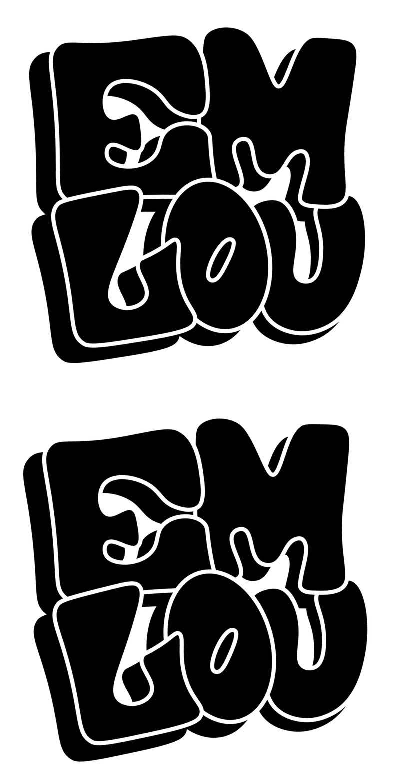
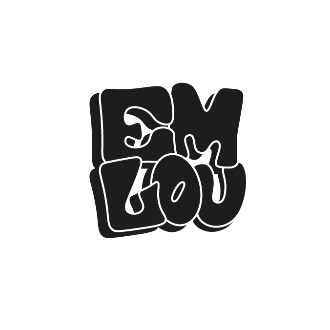
The concept behind my branding, was to create a fun and playful logo that represents a personal identity of my work. To emulate this, I created my own typeface, and explored a range of
Logotypes_____________
Typography__________
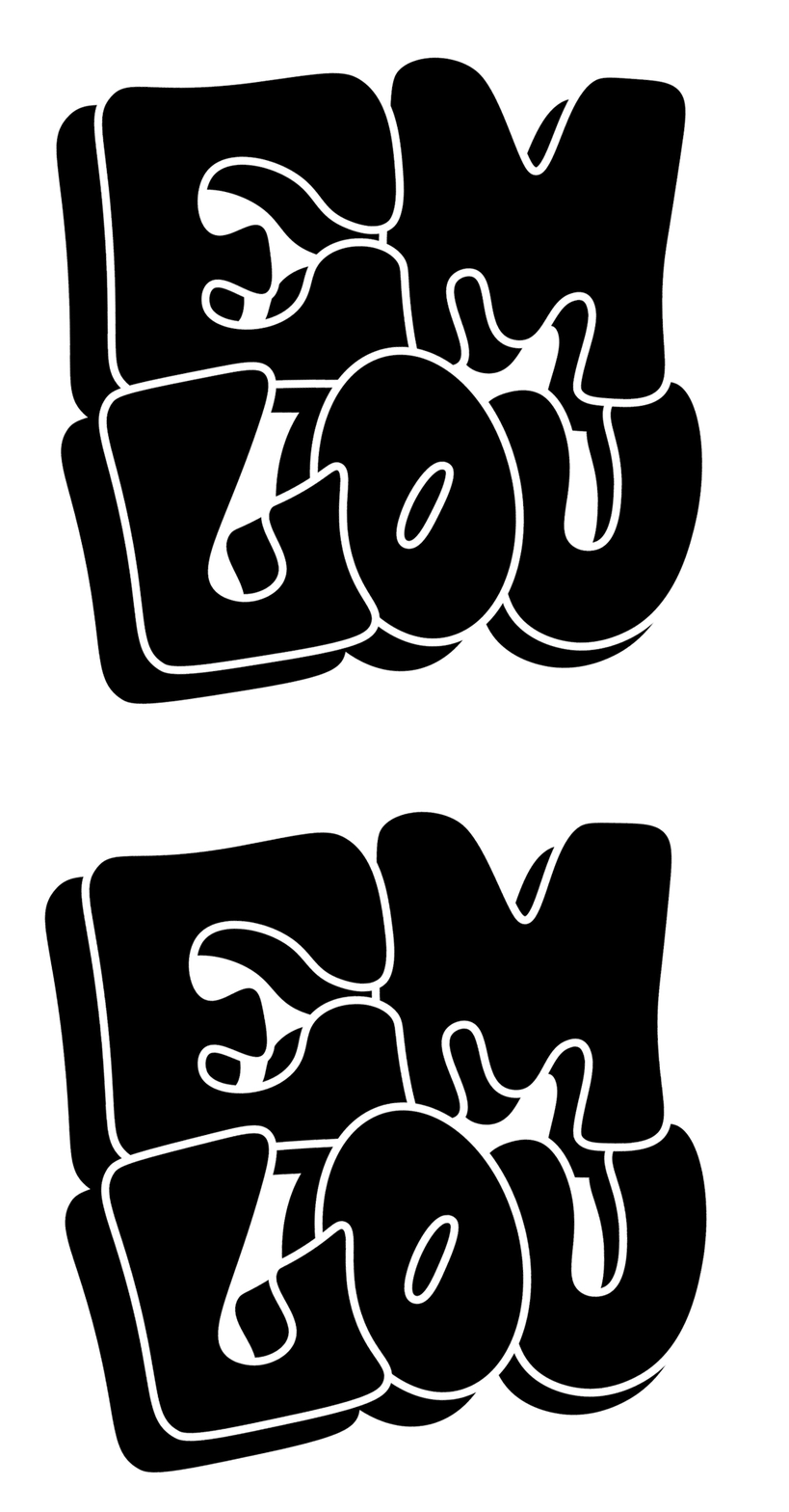
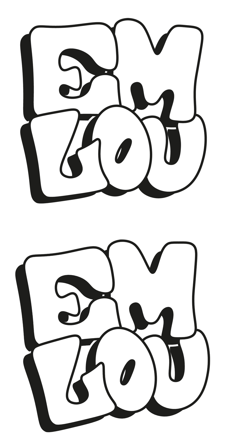
For this project, I created my own typeface in Adobe Illustrator as an extension of my logo. This typeface has two variations; an outlined and single letterform.
I wanted the type to have a-lot of personality, which is why they are not standardised in terms of weight and size, I kept a slight variation to mimic my own handwritten writing style in a digital format.
GIF Series____________
As part of my personal branding, I created GIFS intended for web. I feel that this helped bring my logo to life create more visual interest.

Logo Development________
Initial Sketching
In theres early sketches from the start of my personal branding work I used grid paper to draw some lettering. I was aiming to come up with a variation of possible solutions to develop further. The logo I chose to refine was the 'em lou' in which I tried to give the letters a more organic form, and less rigid than the square designs.
Logo Experimentation______
At the start of my personal branding process, I experimented with manipulating my abbreviated name to explore options of what my logo could look like.
Digital Development________
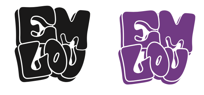
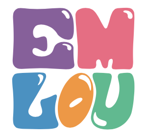
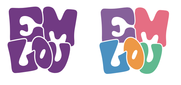
After my initial sketches, I moved to Illustrator to start vectorizing my designs. From here I was able to eliminate some ideas, and move forward with the top left design. After this, I worked to make the design more legible by creating more space in between the letters.

Digital Logos_____________
3D Forms
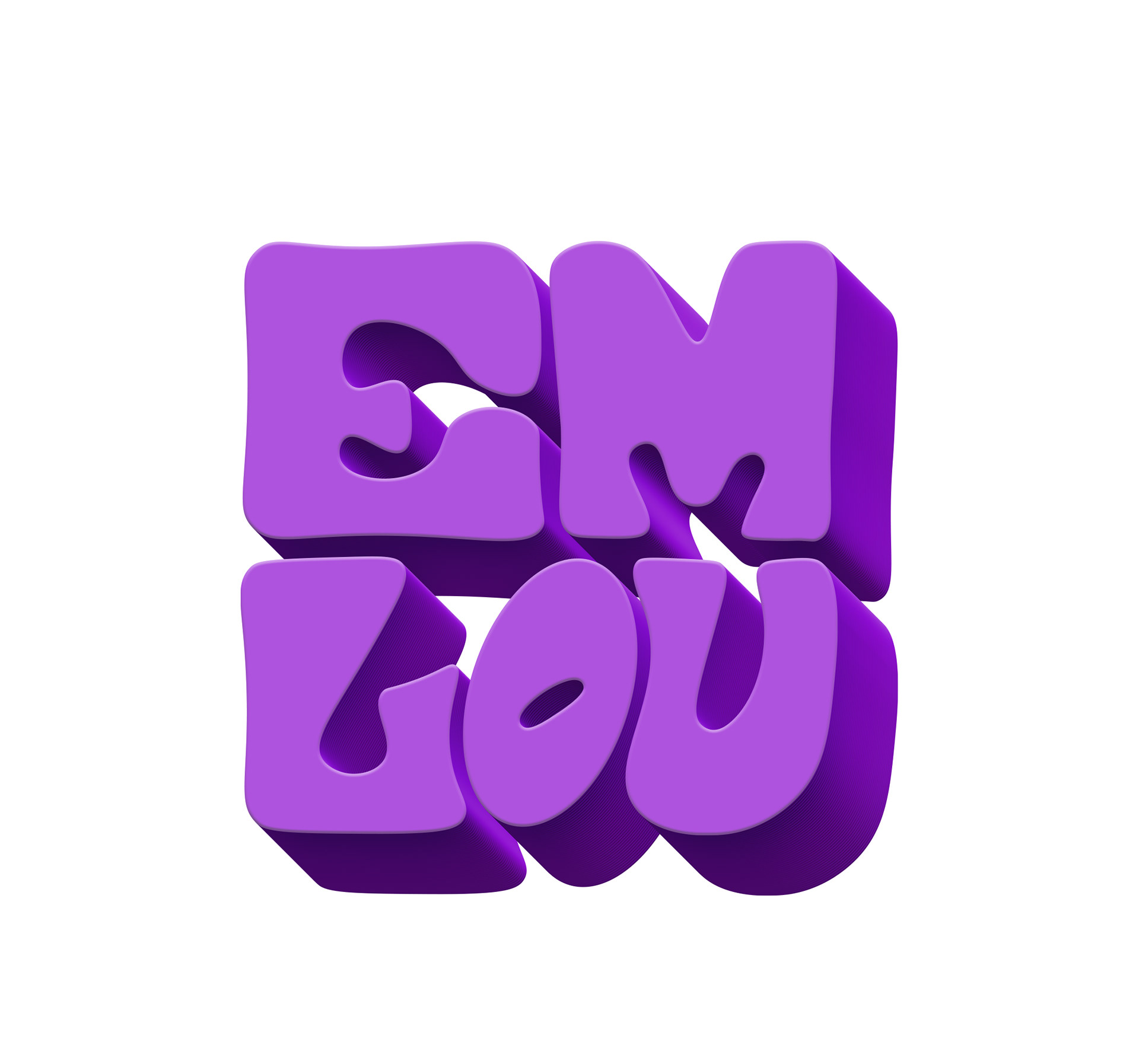
Along the process I experimented with making my logo into a 3D form. After doing this I decided to continue working with my previous 2D logo as I felt it worked better as a scalable logo.


Business Cards______
