
Typography
Type 1&2 | SMC 2022 _______________________________________________________________________________________________________________________
Magazine Cover & Spread
Brief
_____________
Outcome
______________
_____________
Tools
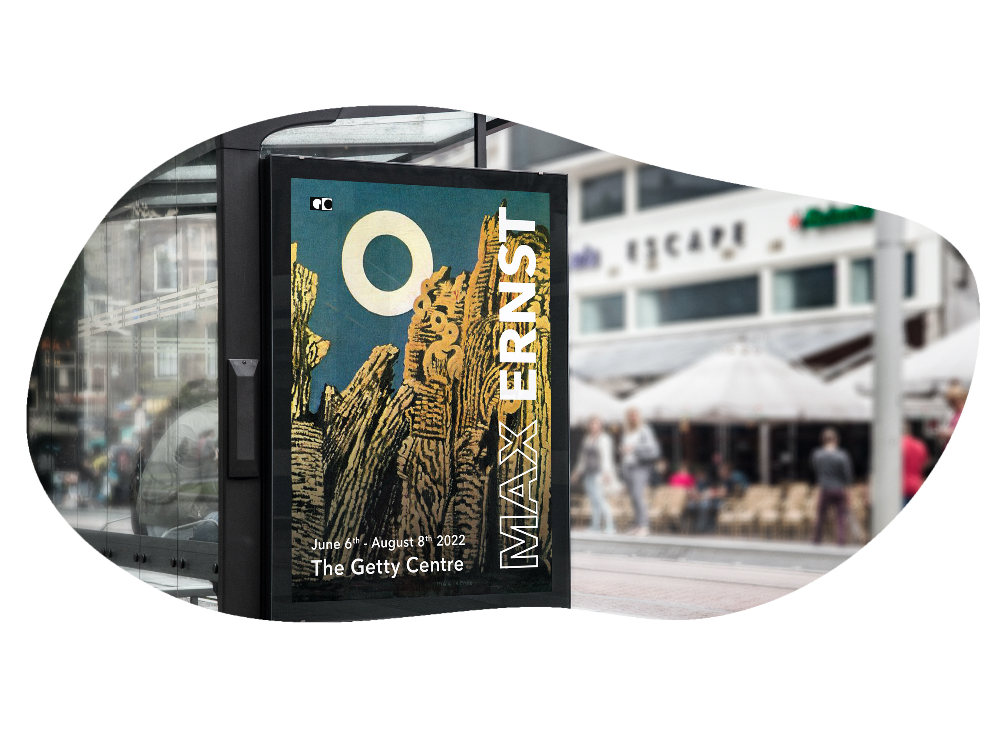
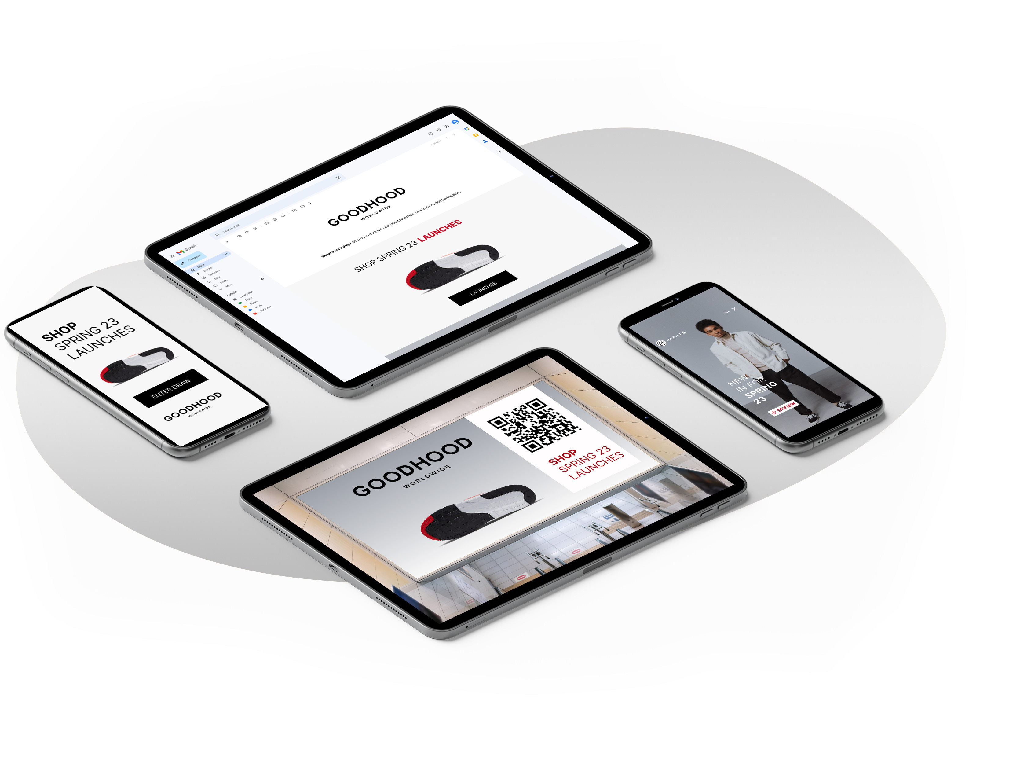
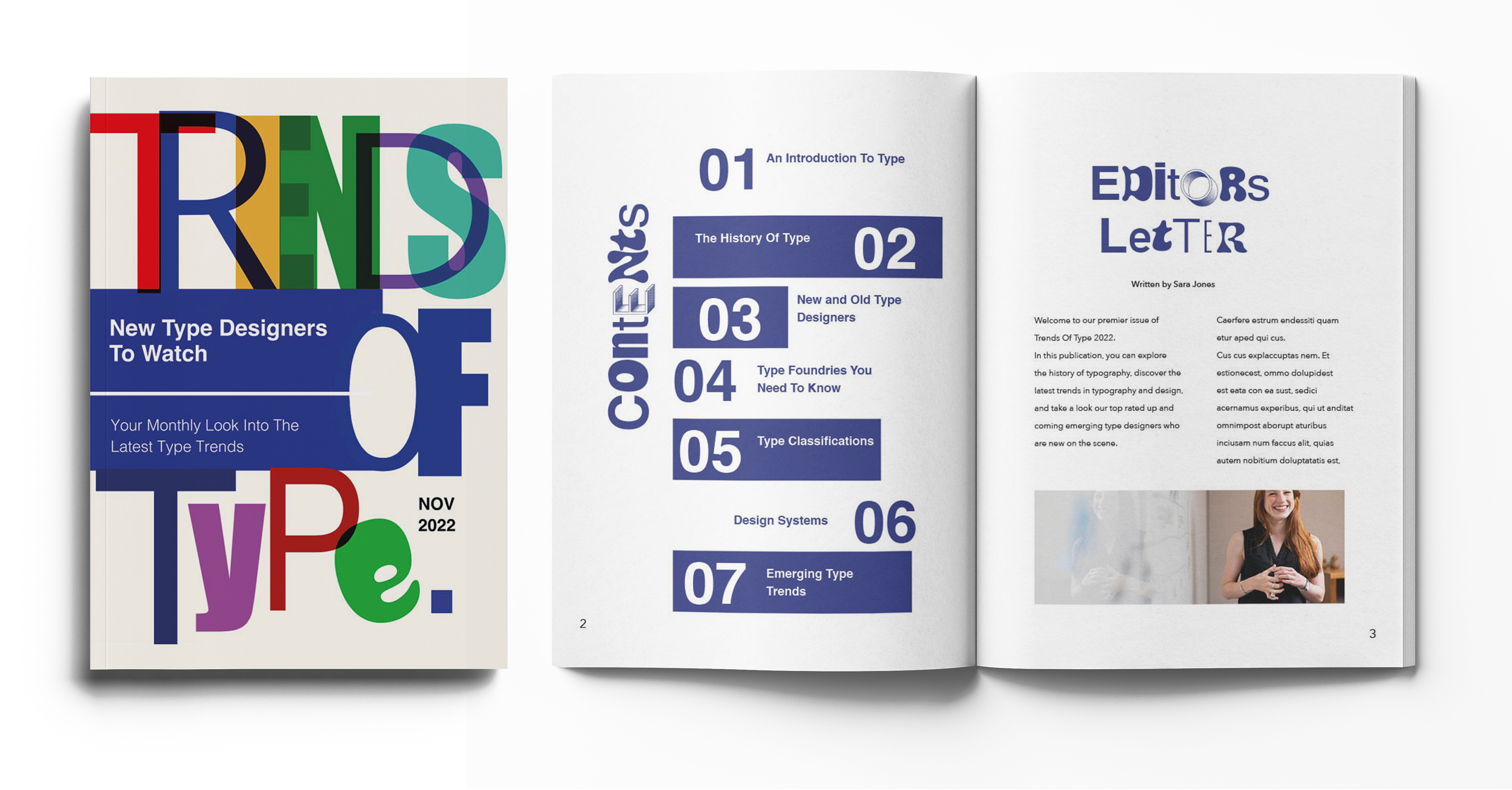
Create an 8 page magazine consisting of a cover page, contents, editors letter, departments page, and two double page feature spreads, on the subject of typography. _________________________________________________________________________________________
The concept for this design was to display past and current trends in typography and design; a curation of text and image. The target audience aims at ages 18-35, and those who work in a creative field, or anyone with a passion for design. My design solution explores layering and combing a mixture of type to showcase a range of typefaces and how they interplay. I utilised a baseline grid system to organise and present my information and contents. _________________________________________________________________________________________
Adobe Photoshop, Illustrator, Indesign
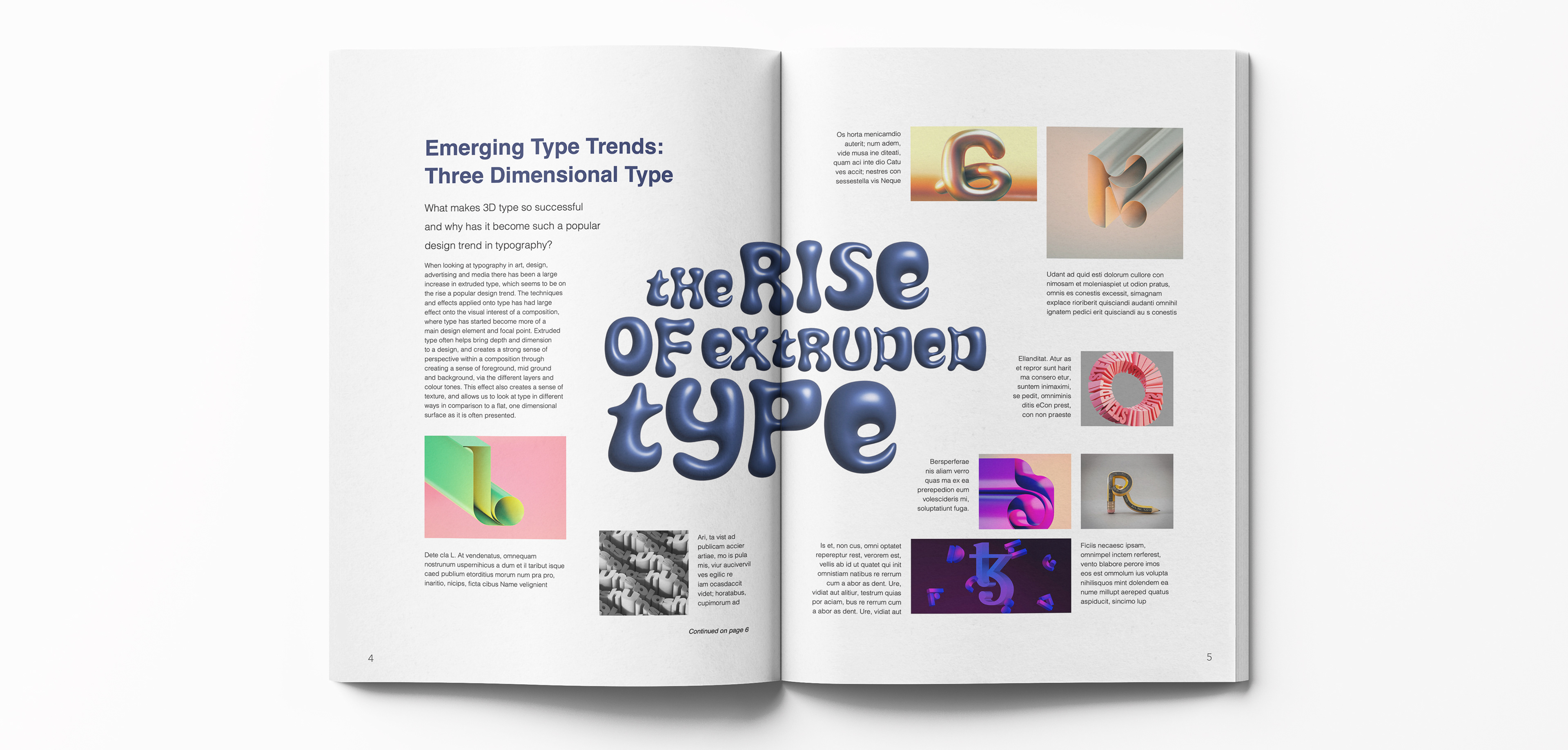
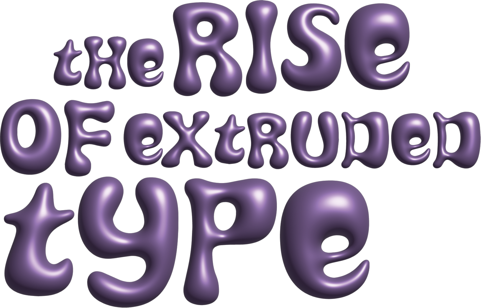
Exploring 3D Type_____
For the theme of my magazine, I chose to look at past, emerging and existing trends in typography. This project allowed me experiment with creating three dimensional type to create a fun and dynamic design for the feature spread article.
Brief
_____________
Outcome
__________________________
Tools
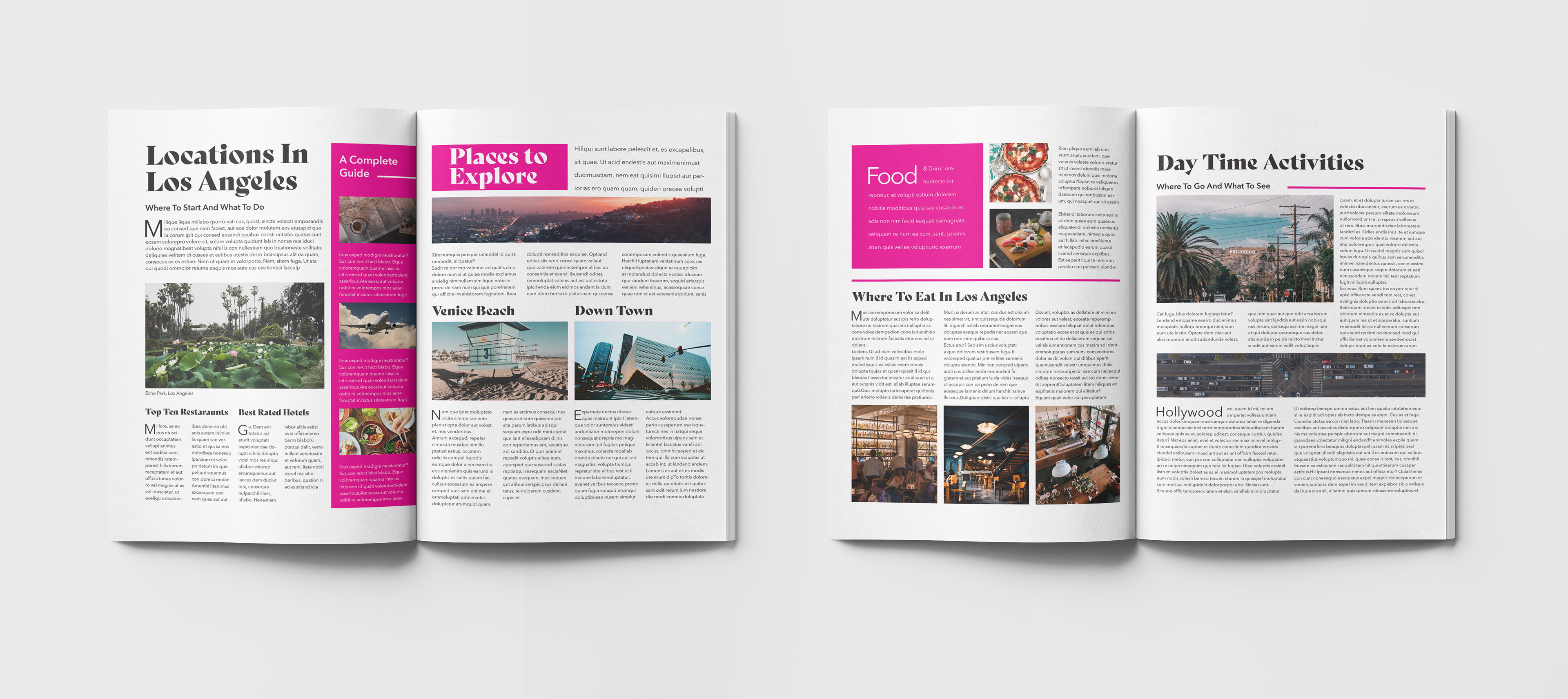
Design a four page spread utilising a 13 pt modular baseline grid typographic system. All text must lock to the baseline grid, to create a cohesive design exploring layout.
_________________________________________________________________________________________
The outcome for this design combined several modular formats consisting of a range of rows and columns, to create varied design components, and to explore scale whilst operating within a grid system. Colour has been placed intentionally to draw focus onto featured areas, and break up areas of the page for an easier, and more interesting overall viewing experience. _________________________________________________________________________________________
Indesign
Typographic Promotional Posters

Brief
_____________
Outcome_____
__________________________
Tools
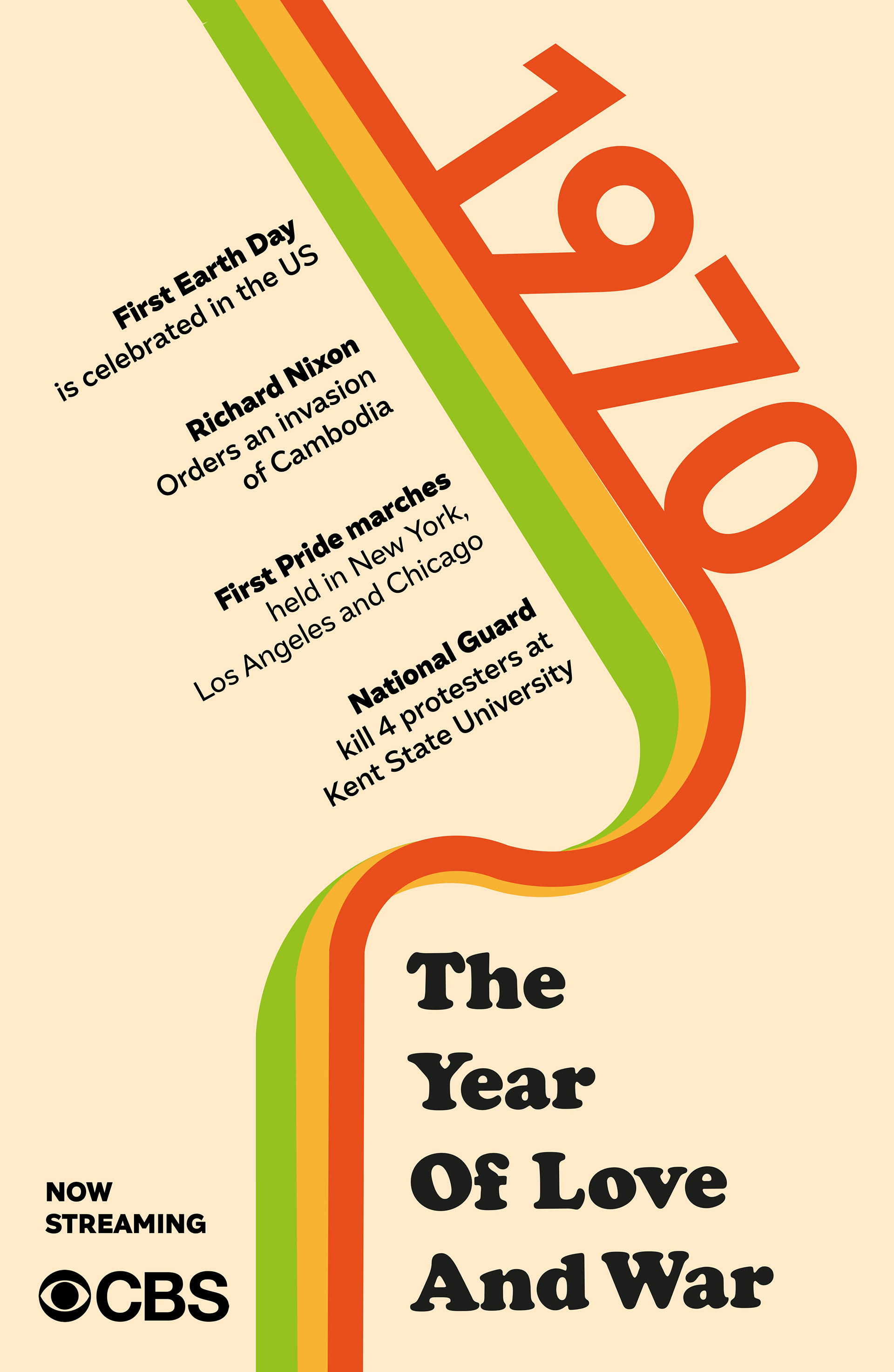
Design a promotional poster ad for a TV documentary about a specific year in American History.
Utilise type as the primary design element and use space on the page creatively. Explore various typographic systems_________________________________________________________________________________________
The poster designs created aim to visually portray the year 1970 through incorporating recognisable design elements of the time emphasised through the earth toned colour palette and curved shapes. In this design I utilised the axial typographic system, and used Cooper Black as my primary typeface to further illustrate a classic look of the 1970s
_________________________________________________________________________________________
Adobe Illustrator
Top Ten Poster

Brief
_____________
Outcome
__________________________
Tools
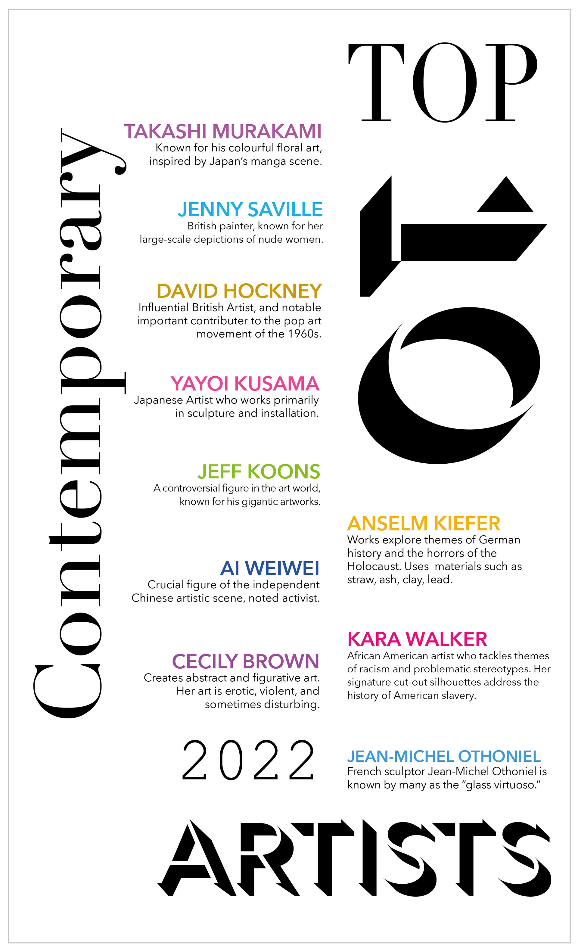
Design a poster that illustrations a 'top ten' feature from a subject of choice. The goal of this project was to keep the focus of the composition on the typography whilst exploring typographic systems for layout.
_________________________________________________________________________________________
For this design I explored the axial typographic system to present my top ten features. To frame this, I explored type in varied points and weights and typefaces, in order to add depth to the design and play with scale.
________________________________________________________________________________________
Adobe Illustrator